HANDWRITING NOTES
Originally written in Autumn of 2022.
dalisay: almost completely prefers to type things out, it actually often hurts hir hands to physically write. kind of incoherent and drifty, letters often look undistinct and ‘scribble’-y to onlookers but sie actually has very minute distinctions between letters that make sense to hir eye
somsak: surprisingly clean and distinct, fairly rounded with distinct shapes for every letter? HONESTLY the closest i can get to describing it is one of those dyslexia friendly fonts thats very easy to read. even when he’s writing fast it doesn’t get scratchy or clumped. he constantly was that one kid in school who constantly get asked to write shit for others in class and thats why hes like that nowadays
mazin: extremely fancy, basically as close as you can get to cursive without it being cursive. lots of arches and points. dont really know what else to say…
peixin: strong deriviations between letters, spacing is all over the place… their writing occasionally feels puzzle-like and more oriented toward avant garde composition than raw undecorated text. i don’t know how else to put it beyond “everything they write looks more like a logo than anything else”. probably because they mostly type as well and the most they do with Proper writing is sign their name on things
demeter: kind of pointy, letters are very small and close together… very decorative with those little loops and squiggles at the arches of certain letters, sometimes arbitrarily? also very archy and pointy in general but not angular. it’s like a needle and a string…
ulises: very rounded, but accentuates curls in letters and tries to make each letter look unique at a glance. though she’s experienced with thick scribble-cursive that’s barely legible when she’s taking fast notes, nowadays she does that shit digitally or magically and reserves handwriting for quainter things where she can take her time.
sabri: handwriting is fairly small, troubled distinction with capitals and certain letters like a/r/e blend. has kind of a zigzag to her lettering… random ‘scribbles’ between letters where she accidentally latches on to letter motions whilst moving on to a new one.
beatrix: rarely writes by hand, and if she does exclusively in a rounded curve-heavy small caps. finds it too bothersome but doesn’t like succumbing to ‘scribbling’ either.
marjolaine: EXTREMELY concerned with ornate swirls and swoops, letters are interconnected no matter what but she’s often dismissive of making letters look distinct. has a ‘cleaner’ serif-y handwriting that she uses with professional documents and whatnot but when she’s writing privately she embraces the artistry in her handwriting. i like the idea of it looking weirdly frantic…
freya: when writing things down for public view/other people in general usually likes really fancy cursive because she likes its elusiveness… cursive has fallen out of style by the 22nd century! fun fact! that might’ve been important to mention beforehand! but if shes just writing notes down for herself or whatever she’ll use a rounded small caps kinda writing. type of person to add little dots for is also
olzhas: very angular and typewriter-y strangely enough? but e writes quite fast since es accustomed to it. makes extensive use of bleedthrough lines between letters, by which i mean if theres a word thats like got two successive ts e’ll write down the two curves and then use one line between them. eir numbers also look very digital alarm clock-y. any optional lines for letters/numbers like zs and 7s e’ll strike through, will write qs as Os with a big line across, etc. also does the small caps thing
isel: kind of gets by with the doctor method of cursive LOL. he’s focused on writing fast without really having legibility in mind, since he mostly only writes for himself, and so he may just write an initial and scribble the rest of the word and its enough for him to get it. words often drift, spacing can oscillate between both lines and letters and he scribbles things out a lot. otherwise likes his loops and broad strokes. he prefers typing things out when it comes to extended writing/anything he has to share with others.
valerie: very oscillatory in terms of letter sizing — extends capitals and ls and ts and js but keeps other letters quite small. basically just likes squeezing letters together for space… overall has a very clean readable ‘font’
faris: also mostly types. pointy small caps otherwise? i dont know. i ran out of distinctions ill draw it out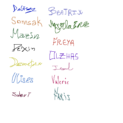
^ not signatures or anything i just dont want to write out long phrases on a trackpad. but these are demonstrations of handwriting